
The goal of a design system is to have everyone using it across apps, products, and teams, but achieving that is easier said than done. It’s no mystery that the easier a design system is to use the more uptake it will get. But a design system’s ease of use is oftentimes contingent on how good its documentation is.
Using Storybook can move your team a long way towards creating effective and easy to use documentation for a design system. Storybook allows you to showcase “stories” for each of your design system’s elements, including permutations of their visual and functional options. As your design system grows, you can add to the stories you tell about it.
However, teams often hit a point in which there’s so much information that Storybook becomes hard to use and navigate. Designers have to scroll through APIs that are not relevant to them, or decipher technical names that have been generated for their UIs. Developers similarly have to skip through the various design edge-cases to find the parameters they’re interested in. Too often what was once a manageable collection of stories becomes as long as the classic One Thousand and One Nights.
One obvious solution to arrive at more usable documentation for both groups would be to create a version for designers and another one for developers. But maintaining two Storybooks would require a lot of work and result in a fair bit of duplicated effort.
As it turns out, we don’t have to keep two separate Storybooks to achieve the same usability goals for both designers and developers. In this article, I’ll explain ideas to generate Storybook stories straight from your codebase, and thus avoid maintenance churn. After that, I’ll overview techniques to generate two different sets of documentation from a single Storybook using build options.
Documenting Design Tokens
Storybook allows you to document your stories with @storybook/addon-docs, including design tokens and other elements of your design system.
For example, you can use blocks from @storybook/addon-docs to document your color palette:
import { ColorPalette, ColorItem } from '@storybook/addon-docs/blocks';

export const Palette = () => (
  <ColorPalette>
    <ColorItem title="Primary" subtitle="Pink" colors="#F74D7B" />
    <ColorItem title="Secondary" subtitle="Dark" colors="#15325D" />
    <ColorItem title="Tertiary" subtitle="Blue" colors="#26ABE7" />
  </ColorPalette>
)
Similarly, there's other blocks available for documenting other design tokens such as typography (<Typeset>) and iconography (<IconGallery> and <IconItem>).
The full documentation for these blocks is yet to be completed, but in the meantime you can read an explanation about them in detail in Storybook’s team announcement: “Rich docs with Storybook MDX." While inputting design tokens documentation by hand is simple, it can be redundant because we have already stored those values in our codebase. We can leverage that existing code to guarantee up to date documentation – and avoid extra work.
In the case of the color palette, we don't need to list the colors manually: as we usually store them as a JavaScript hash, we can iterate and display them all one by one as shown in this example:
import { ColorPalette, ColorItem } from '@storybook/addon-docs/blocks';

import { colors } from 'path/to/tokens.js';

export const Palette = () => {

  return (
    <ColorPalette>
      {colors.map(color => <ColorItem title={color} subtitle="" colors={[color.value]} />)}
    </ColorPalette>
  )
}
We can extend this idea to document helper classes that assign specific text colors, background colors, margins, padding, and borders. These kinds of classes are typically used for fast prototyping. Helper classes are handy for making quick changes and variations like these:
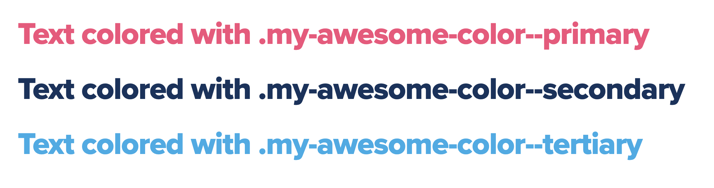
Classes are not stored in a hash, but we can iterate through CSS classes directly just as we did for the colors.
You know the saying: it’s easier to show than tell. So instead of just listing the available classes, you can document them applied to a <p> element so people can immediately see the effect of the class. An implementation could look like this:
import styles from 'path/to/_helper-classes.scss';

export const textColors = () => {

  const textColors = Object.keys(styles).reduce((acc, key) => {
    if (key.startsWith('color--')) {
      acc.push(key)
    }
    return acc;
  }, []);

  const textColorSamples = textColors.map(cl => (
    <div className={styles[cl]}>Text color with .{styles[cl]}</div>
  ));

  return (
    <div>
      {textColorSamples}
    </div>
  );

};
As you can see, the story imports the SCSS file used in the codebase, which means even the documentation of helper classes is automatically up-to-date and accurate.
We can generate stories from our codebase for other types of design tokens. For example, if your design system contemplates button variations or icon options, you can take them from your code and display them automatically as well.
But here’s where things can get messy. Let’s take a closer look at the example of icons. A single project can use hundreds of icons, and each can be available in light, regular, or filled – not to mention that each of those can be available in different sizes. If we generated a story that displayed every possible permutation of the icons available from the code, we’d get a grid with thousands of icons that would endlessly go on like Scheherazade speaking to the king. Nobody wants to scroll infinitely trying to find a single icon!
When we’re confronted with such a situation, bringing in some interactivity to our story can help. To make the list of icons more useful, you can implement a component that generates all of the icons from the codebase but offers filters to show only those that are interesting for the user, depending on type, size, and even name:
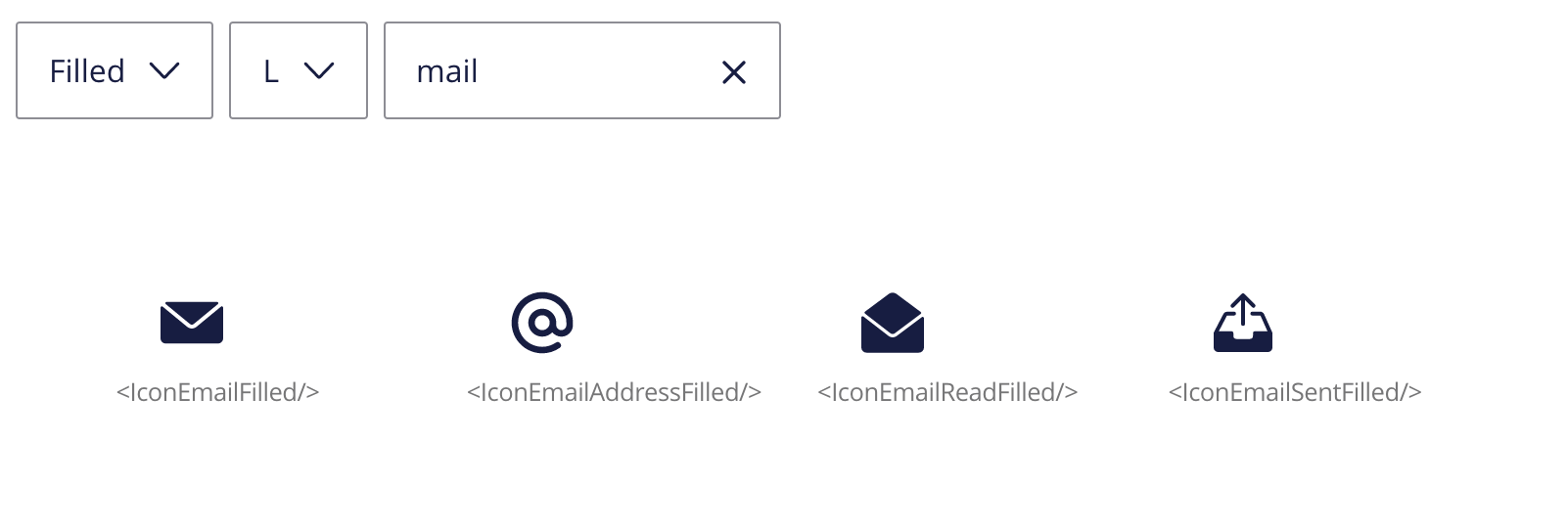
As you can see in the screenshot above, generating the icons from the codebase has another feature (or challenge): the names are written as they are in the codebase, like <IconEmailFilled />. For developers, this is great because that’s exactly what they want to know. However, designers may find such names quite confusing, especially if your designers are consuming your stories through a tool like ZeroHeight. Is there a way we can summon Aladdin’s genie from the lamp and have him grant us a wish to solve this conundrum?
Different users, different stories
Designers and developers are interested in different aspects of a design system: a designer wants to know about edge-cases in the UI like a button with a very long text, while developers want to know about how onClick works in a given component. Trying to cobble together both perspectives in the same story doesn't work very well, so instead I usually write separate stories for developers and designers. Before you raise your hand, let me explain that I don't maintain two Storybooks (that'd be hard): I host two different kinds of Stories in the same Storybook but in order to avoid the copy-paste one is usually inherited from another. They are also seasoned with different decorators, bringing only the desired experience to their target audience.
My Storybook is implemented so that the same component has some stories that describe it from the design perspective and some that are good to follow for developers. Mostly, the difference is in what I explain about each component's story. In the design-oriented stories, I show what visible variations a component might have and the design edge cases. While in the stories for developers I focus on functional features of a component.
However, not every component needs separate stories for designers and developers. There's cases when you only need to make a small tweak to the content to make it fit the needs of developers or designers.
Let’s go back to that list of all icons where the names were equal to the corresponding React components and therefore served the needs of developers. For designers, I coded a second story. Instead of showing the react component name, it displayed the icon’s name from the component’s meta data. Since I coded the icons story to be generic enough, I didn't have to make any copy-paste to create two stories. Instead, I only need to reuse the story and tell it which kind of name to use by passing in a parameter. The designers’ story would look like this:
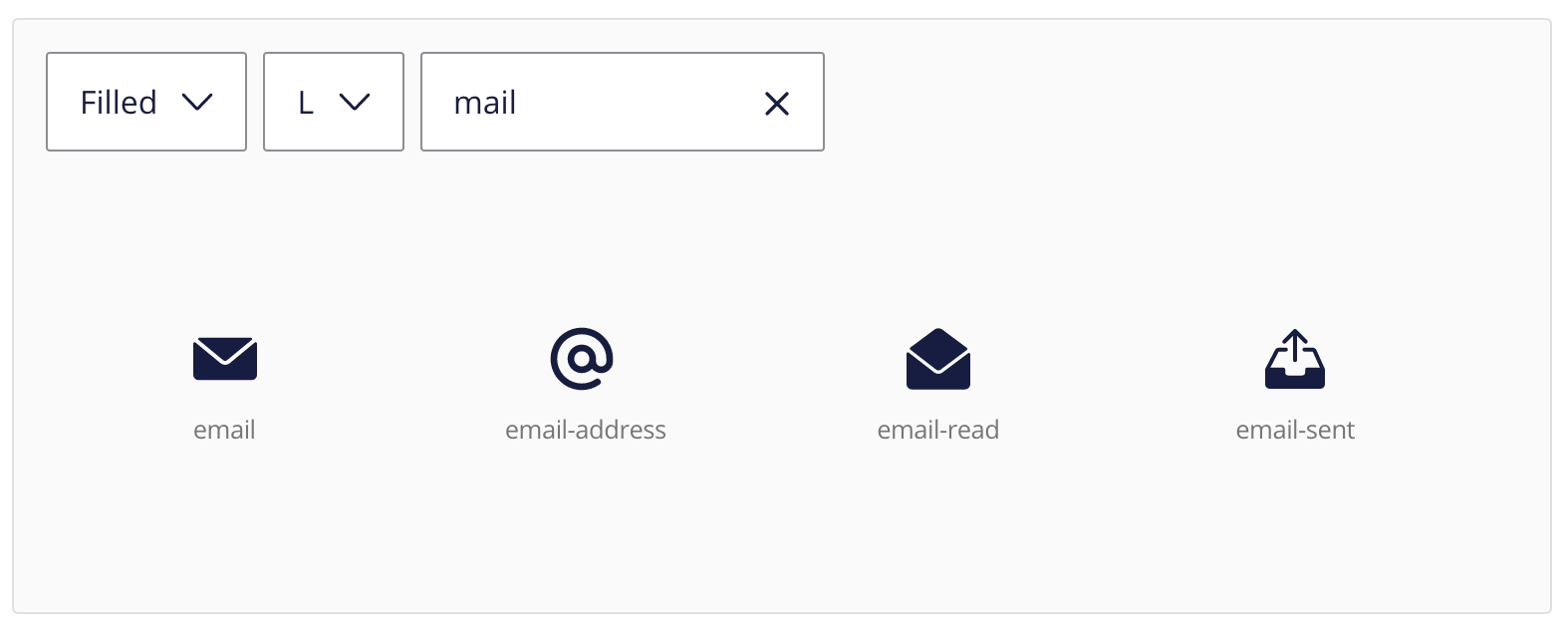
It is possible to keep pushing towards a more refined experience for our readers depending on how they consume Storybook. For example, in a project I lead, developers used a special UI to keep documentation on sight on a side screen while they coded. In that case, a different background and a thicker stroke around stories came a long way to provide a nicer UX for them. However, those styles would look odd for designers who only consumed Storybook through a regular web view.
You can generate two documentations with different styles without having to manage two Storybooks or make any copy-pastes in the process. The key is to rely on decorators to apply special styling (and do any other needed processing to the story) depending on its target audience;
For instance, you can implement a @developerStory decorator that would only be applied to the stories kept in the files with a special .docs.stories.js.This decorator performs all the necessary style adjustments to the display of the stories when they are built. And you can do this all with a single line of code! It looks like Alladin’s genie (or rather Storybook’s genie) came through for us.
When it’s time to ship our documentation to their target users, having enriched stories allows you to have more granular control over how the production build will look like. You can go as far as having two different Storybook configurations that you toggle with a flag on the build command. Or you can decide to not include stories for developers for a target site (for instance if it'll be consumed by a tool like Zeroheight). The opposite outcome is also possible: you can build a site that targets developers only and not show the design-centric stories.
In other words, pretty much anything you could wish for.
Conclusion
The tips and tricks written above are indeed not the only things that one can do to improve the Storybook setup. But they nicely illustrate how you can tailor your team’s Storybook to improve your design system's adoption across your organization and make its users more satisfied.
Varya Stepanova is a design systems architect—and co-creator of BEM—based in Finland. Varya has improved the way dozens of teams, large and small, develop and evolve their design process towards better collaboration among stakeholders.