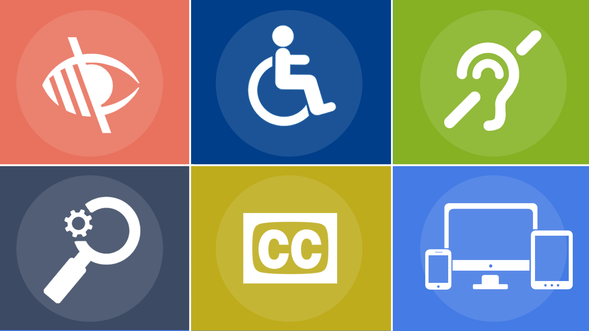
WCAG 2.1: What does it actually mean?
Robert DeLuca
July 14, 2018
Publication as a W3C Recommendation finalizes the development process and indicates that the W3C considers the updated guidelines ready for implementation on web content.
Last week WCAG 2.1 (Web Content Accessibility Guidelines) was recommended by the W3C, which means they have finished it and it’s ready for everyone to start implementing.
WCAG 2.0 was completed in 2008, back when touch devices were not as popular and tablets didn't exist yet. Since 2008 these devices have become the most prevalent way to access the web, but there were no success criteria that addressed accessibility for this input type. That is the main theme of WCAG 2.1: take into account touch devices. There are also a lot of new success criteria that address cognitive limitations too.
Within WCAG there are three levels to conform to: A, AA, and AAA. Level A is the lowest bar of conformance and level AAA is the highest. These WCAG levels cascade, so if your app conforms to WCAG AA, it also conforms to WCAG A. Most companies shoot for AA since AAA has success criteria that are a little hard to reach and not all content can conform to AAA.
In WCAG 2.1 there are:
- 5 new A success criteria
- 7 new AA success criteria
- 5 new AAA success criteria
Let's go over all 17 new success criteria to see what they are meant to solve and what it means for you. If you read the details for each of those success criteria some of them are straightforward and others aren’t. So I’m going to give my TL;DR version of the success criteria.
Level A
There are five new success criteria for level A, which is the lowest level of conformance you can achieve (aka the easiest). The new success criteria are:
- 2.1.4 Character Key Shortcuts
- 2.5.1 Pointer Gestures
- 2.5.2 Pointer Cancellation
- 2.5.3 Label in Name
- 2.5.4 Motion Actuation
2.1.4 Character Key Shortcuts
Assistive tech users have a lot of their own key combos for navigating and interaction. This success criterion is to ensure you don’t implement keyboard shortcuts that would prevent their functionality.
If you have any custom keyboard shortcuts implemented, one of the following need to be true:
- The ability to turn off the shortcut
- The ability to remap the shortcut to something different
- The keyboard shortcut is only present if the component is focused
You can read the reasoning for it and many more details here.
2.5.1 Pointer Gestures
Since the last WCAG spec release there has been a lot of innovation on the web regarding touch devices. For example, with Google Maps you can use multi-touch gestures to pinch and zoom around the map.
This success criterions says if there are multi-touch or slide gestures present, there must be a single input method also available. To keep with the maps example, there should be + and - buttons available to provide non-pointer gesture interactions for this success criterion to pass.
If the gesture is “essential” you may not need to worry about this one. They define “essential” as:
If removed, would fundamentally change the information or functionality of the content, and information and functionality cannot be achieved in another way that would conform
You can read the reasoning for it and many more details here.
2.5.2 Pointer Cancellation
For interactions that can be done with a single pointer (clicks, single taps, long presses, etc.), you must provide a way to cancel it. One of the following must be true:
- Don’t use the
downevent (touchstartormousedown) - You have a way to undo the action
- The
upevent cancels thedownevent (this is like clicking a link, moving your cursor, and releasing)
You can read the reasoning for it and many more details here.
2.5.3 Label in Name
Say you have an input with the visible label as “Name” and an aria-label as “Enter First Name”, this success criterion would fail. This is because speech input users navigate by saying the visible label. If the visible label doesn’t match the programmatic name (or accessible name) it will fail to navigate.
To drill it home with code, here’s two examples:
<!-- Bad -->
<label for="name">First Name</label>
<input type="text" id="name" aria-label="Enter your first name" />

<!-- Good -->
<label for="name">First Name</label>
<input type="text" id="name" />
You can read the reasoning for it and many more details here.
2.5.4: Motion Actuation
If you have an action that is triggered by motion, there must be a control on screen that performs the same action. For example, if you shake the device to undo text in an input, there should be a clear button available for single pointer devices to activate.
Another example would be images you interact with by tilting your phone around. There should be buttons available that pan / tilt the picture too.
You can read the reasoning for it and many more details here.
Level AA
There are seven new success criteria for level AA, which is the mid-level conformance you can achieve. The new success criteria are:
- 1.3.4 Orientation
- 1.3.5 Identify Input Purpose
- 1.4.10 Reflow
- 1.4.11 Non-Text Contrast
- 1.4.12 Text Spacing
- 1.4.13 Content on Hover or Focus
- 4.1.3 Status Messages
1.3.4 Orientation
Your site or app should work in either orientation: landscape and portrait. Unless it’s deemed to be “essential” to the function of your app:
Examples where a particular display orientation may be essential are a bank check, a piano application, slides for a projector or television, or virtual reality content where binary display orientation is not applicable.
You can read the reasoning for it and many more details here.
1.3.5 Identify Input Purpose
The inputs on your page should fill in metadata to help the user better understand the intention of the form inputs. You can do this by adding autocomplete attributes to your inputs. This is a full list of input purposes.
You can read the reasoning for it and many more details here.
1.4.10 Reflow
This might be my favorite new success criterion! It essentially means your site or app should be responsive. If you can’t make your site or app responsive an alternative could be providing a fixed 320pxwidth version.
The explainer document linked below goes into great detail about why this decision was made and is a great resource for understanding how to pass this success criterion. I recommend reading through this one!
You can read the reasoning for it and many more details here.
1.4.11 Non-Text Contrast
UI components and meaningful graphics must have a color contrast ratio of 3:1 to adjacent elements. This includes all states UI components can have (except the disabled state, which is confusing to me).
For example, a button’s hover, active, and focus states must all pass the 3:1 color contrast ratio. This does not apply to inactive elements (like a disabled button).
You can read the reasoning for it and many more details here.
1.4.12 Text Spacing
Content on your site or app must be able to expand to the following requirements without any loss of content or functionality:
- Line height (line spacing) to at least 1.5 times the font size
- Spacing following paragraphs to at least 2 times the font size
- Letter spacing (tracking) to at least 0.12 times the font size
- Word spacing to at least 0.16 times the font size
That does not mean that your site or app has to implement the above requirements as a baseline. But it should be able to scale to those requirements without losing functionality or readability.
This success criterion helps those who have low vision or dyslexia since they may override the default content styles to help reduce confusion while reading.
You can read the reasoning for it and many more details here.
1.4.13 Content on Hover or Focus
Any content that shows or hides from hover or focus needs to be:
- Dismissable: a way to dismiss the content without moving the pointer or keyboard focus.
- Hoverable: the shown content should be able to be hovered and not dismiss.
- Persistent: the shown content remains visible until the user dismisses, focus trigger is removed, or the information is no longer valid.
The key takeaway here is if you have content that appears due to an action, the user must have control over that content being shown or hidden. It can’t disappear without a explicit dismiss action from the user.
You can read the reasoning for it and many more details here.
4.1.3 Status Messages
The main focus of this success criterion is for screen reader users. When there is a change in content that does not change focus you should provide a status message to the screen reader. This is commonly known as the announcer pattern. I’ve written an ember addon for this and there is a react component that does this too.
An example of this might be when an error on a form is displayed in a banner it should also announce that message to the screen reader through aria-live or role=“alert”.
Pro-tip: be careful when implementing this in your site or app. It’s very easy to get multiple announcers on the page that could announce over each other at any given time. I recommend having one announcer component that serves the entire application. That way there can only be one announcement at a given time.
You can read the reasoning for it and many more details here.
Level AAA
There are five new success criteria for level AAA, which is the highest conformance you can achieve. The new success criteria are:
- 1.3.6 Identify Purpose
- 2.2.5 Re-authenticating
- 2.2.6 Timeouts
- 2.3.3 Animation from Interactions
- 2.5.5 Target Size
- 2.5.6 Concurrent Input Mechanisms
Level AAA is the least common level of conformance but I still think there are success criteria here that should be implemented. Things like re-auth, timeouts, and target size aren’t that hard to implement and probably are already implemented in your app since these are solid UX patterns.
1.3.6 Identify Purpose
This success criterion looks hard to implement properly. The intent is for your site or app to support personalization and preferences. Here are the examples they give in the understanding document:
- A website uses ARIA landmarks to identify the regions of the page, and users can hide areas that are not the 'main'.
- The links in the navigation of a website are marked-up so that users can add their own icons.
- Icons on a website use are marked-up so that the user can substitute their own icon set into the page.
You can see how this one might be pretty hard to do right.
You can read the reasoning for it and many more details here.
2.2.5 Re-authenticating
When an authenticated session expires, the user can continue the activity without loss of data after re-authenticating.
You can read the reasoning for it and many more details here.
2.2.6 Timeouts
If there is a timeout present on the page, there should be a warning shown before the session ends. You should provide a warning for anything that might cause data loss due to the session ending.
These are usually implemented with a modal that pops up warning you that time is running out. Make sure that modal is accessibile too!
You can read the reasoning for it and many more details here.
2.3.3 Animation from Interactions
If you have animations on your site the user should able to be disable them. Unless they are essential. What WCAG defines as an “essential” animation:
A web application provides a feature to author animated sequences. As part of this tool, the author needs to preview the animation.
You can read the reasoning for it and many more details here.
2.5.5 Target Size
The target size of pointer inputs (mouse, pen, touch contact) should be a minimum 44px by 44px unless:
- Equivalent: there is another target on the same page that provides the same action that meets this success criterion.
- Inline: the target is in a sentence or block of text
- User Agent Control: the size of the target is controlled by the user agent & is not modified.
- Essential: the specific presentation is required for the target to function.
You can read the reasoning for it and many more details here.
2.5.6 Concurrent Input Mechanisms
I really like this addition to WCAG. This success criterion says you should make sure your content can be interacted with through different modes of input.
The easiest example to give would be making sure your site or app works if someone pairs a wireless keyboard to their phone to navigate. Another example would be making sure your site can be interacted with from a laptop with a touchscreen. This exact example came up on Twitter over the weekend too!
I like this one because my mom is 100% blind and uses her iPhone with a keyboard a lot of the time. It’s just easier than swiping sometimes.
You can read the reasoning for it and many more details here.
Wrap up
Whew! That was a lot to unpack. One of the biggest struggles I had when getting started in accessibility was finding resources that digested the WCAG spec into more concrete examples. Jumping right into specifications as a first step can be daunting. With that said I hope this post was enough for you to get familiar with the changes to WCAG and what they mean in simple terms.
I think it is worthwhile for you to spend some time reading through a couple of the documents that explain the reasoning for these success criteria. One of the realizations I’ve had when reading through the spec is WCAG is a set of guidelines for improving your site’s UX. Accessibility really is all about making sure your site or app can be used by anyone, which serves as an excellent foundation to build upon for your site’s UX.
If you or your team need any help getting up to speed with WCAG 2.1 reach out to us! If you would like to ask any questions or continue this conversation feel free to reach out to me on Twitter.